
How to choose the paper and layout for a business card
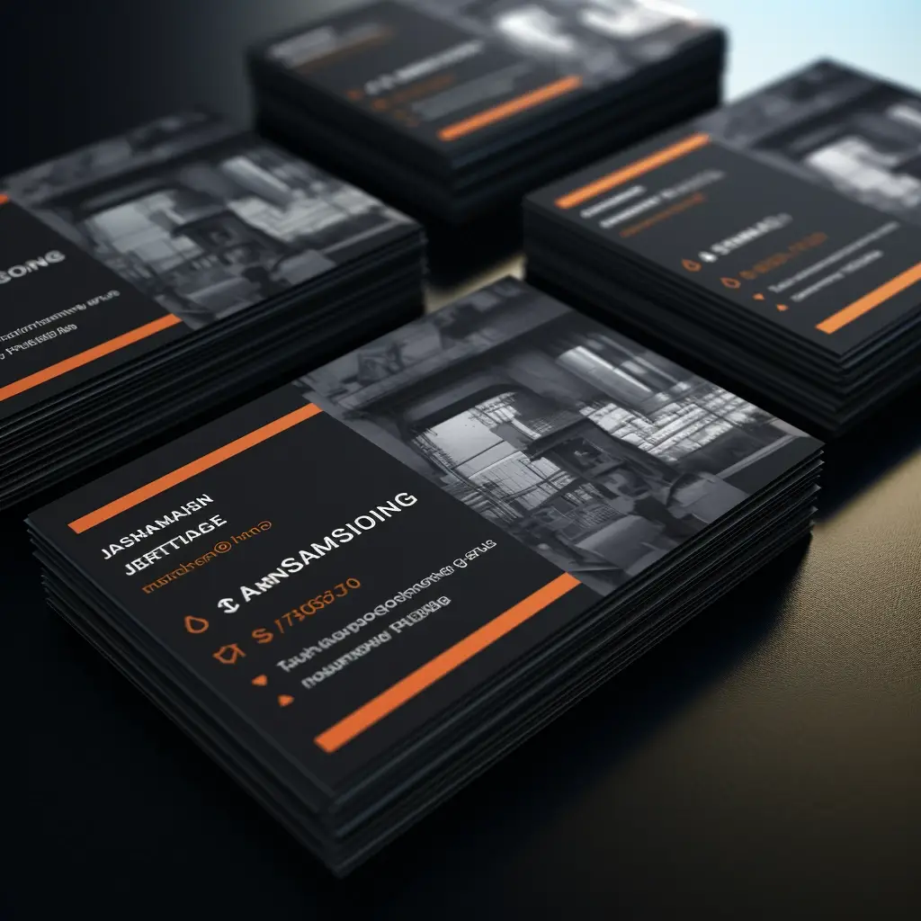
Pick up two cards with the same logo, one on smooth glossy stock and one on textured matt stock. They can feel like they came from quite different companies. Business card paper is part of the design, so it makes sense to choose it while you can still change the artwork.
Start with what someone needs to read. A person’s name, what they do and a way to reach them should be easy to find at a glance. Tiny pale lettering that looks elegant on a bright monitor can fade into textured paper. Print the proof at actual size and read it under ordinary room lighting before you approve a large run.
Use the reverse deliberately. A designer might put an example of their work there. A business that books appointments may want a light, writable area for a date and time. A heavily coated back can work well for the first purpose and poorly for the second. Ask to handle a sample if writing on the card matters.
Send your logo, exact contact details and preferred quantity to our print workshop in Tallinn. We can help with layout or prepare a proof from finished artwork. For a set of employee cards, inspect one proof per person as well as the overall design. A perfectly printed card with one wrong digit still sends a customer to the wrong number.


